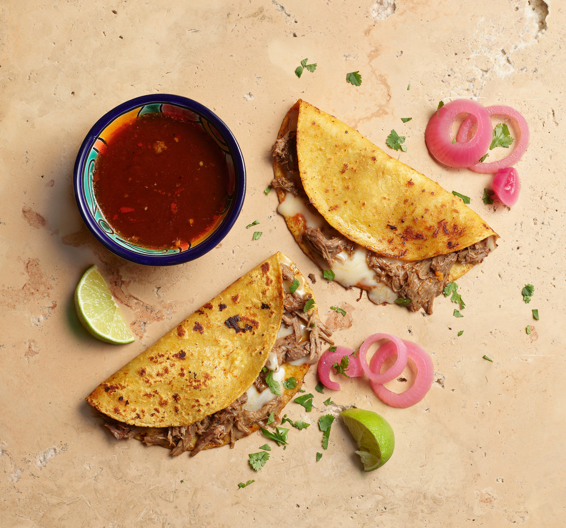
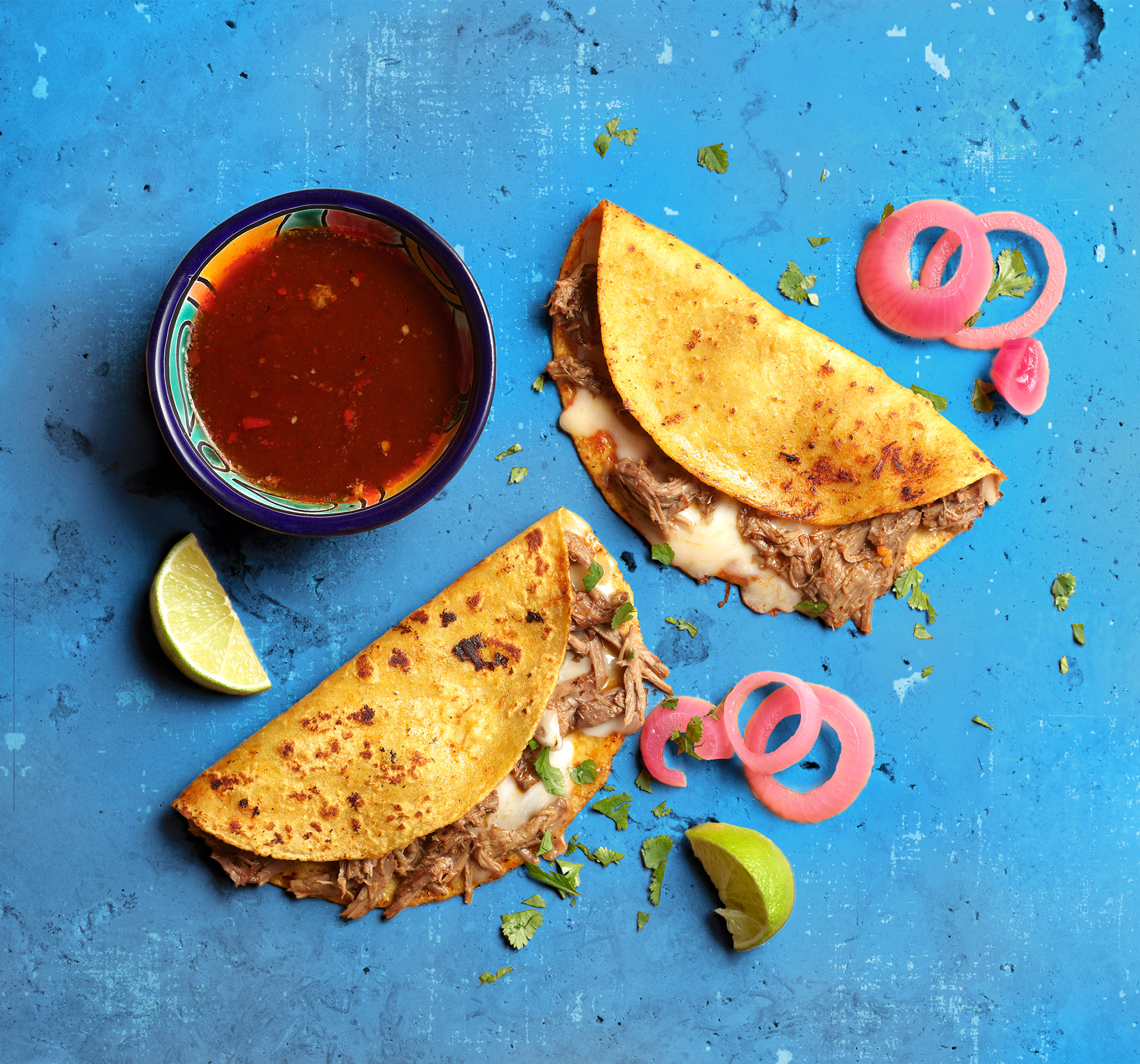
On the above two images I followed art direction for isolating the backgrounds and color overlays and effects to make the image pop.
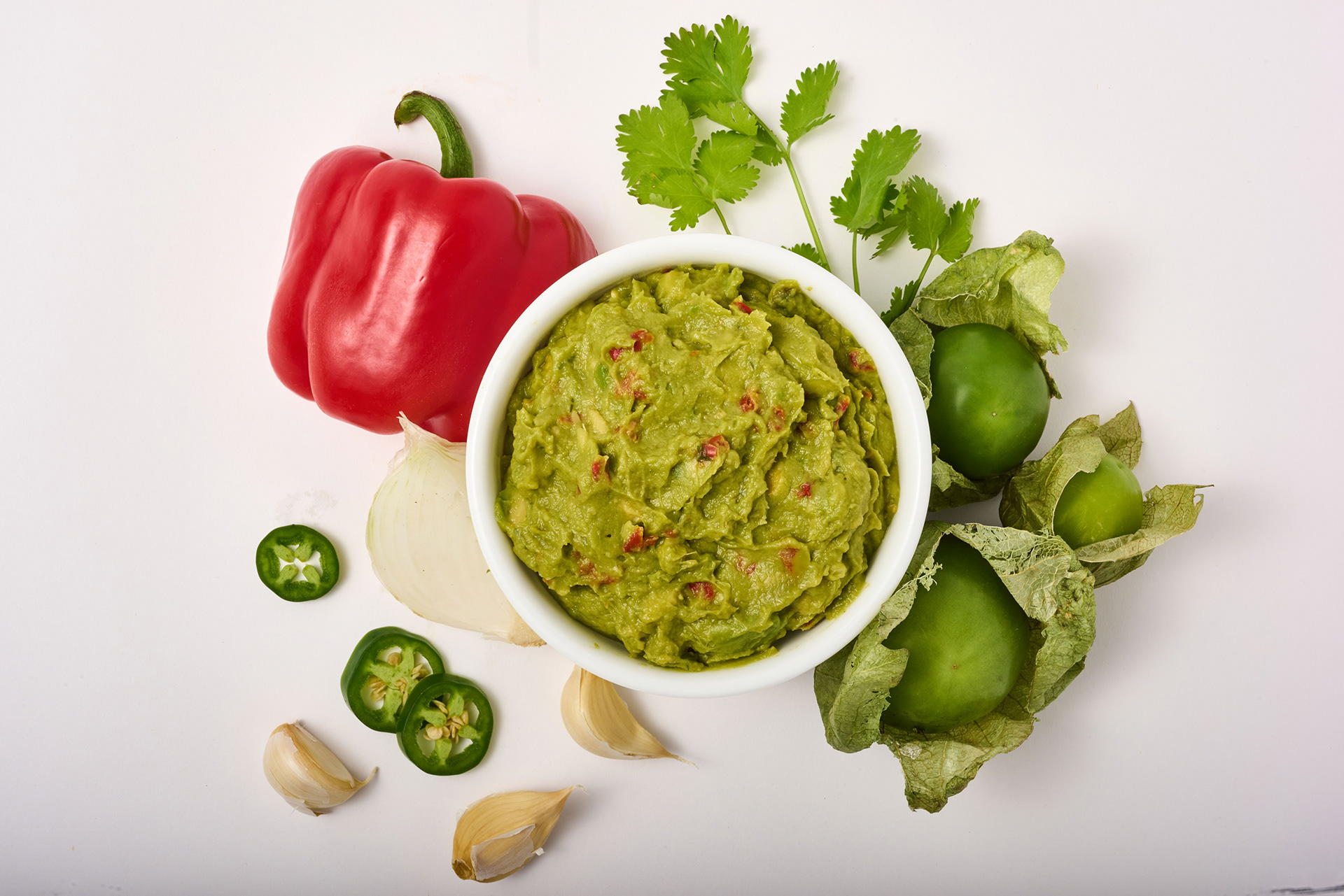
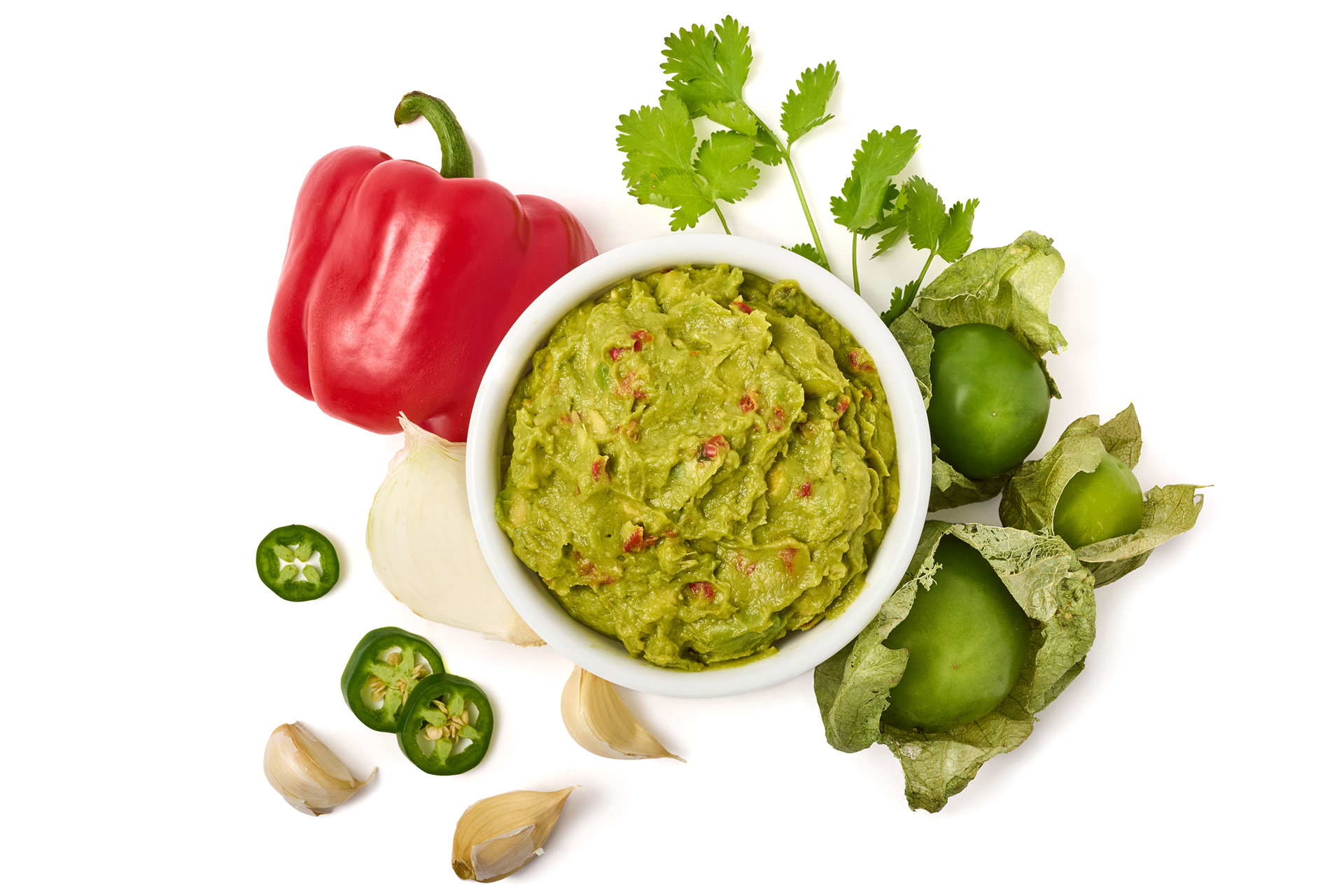
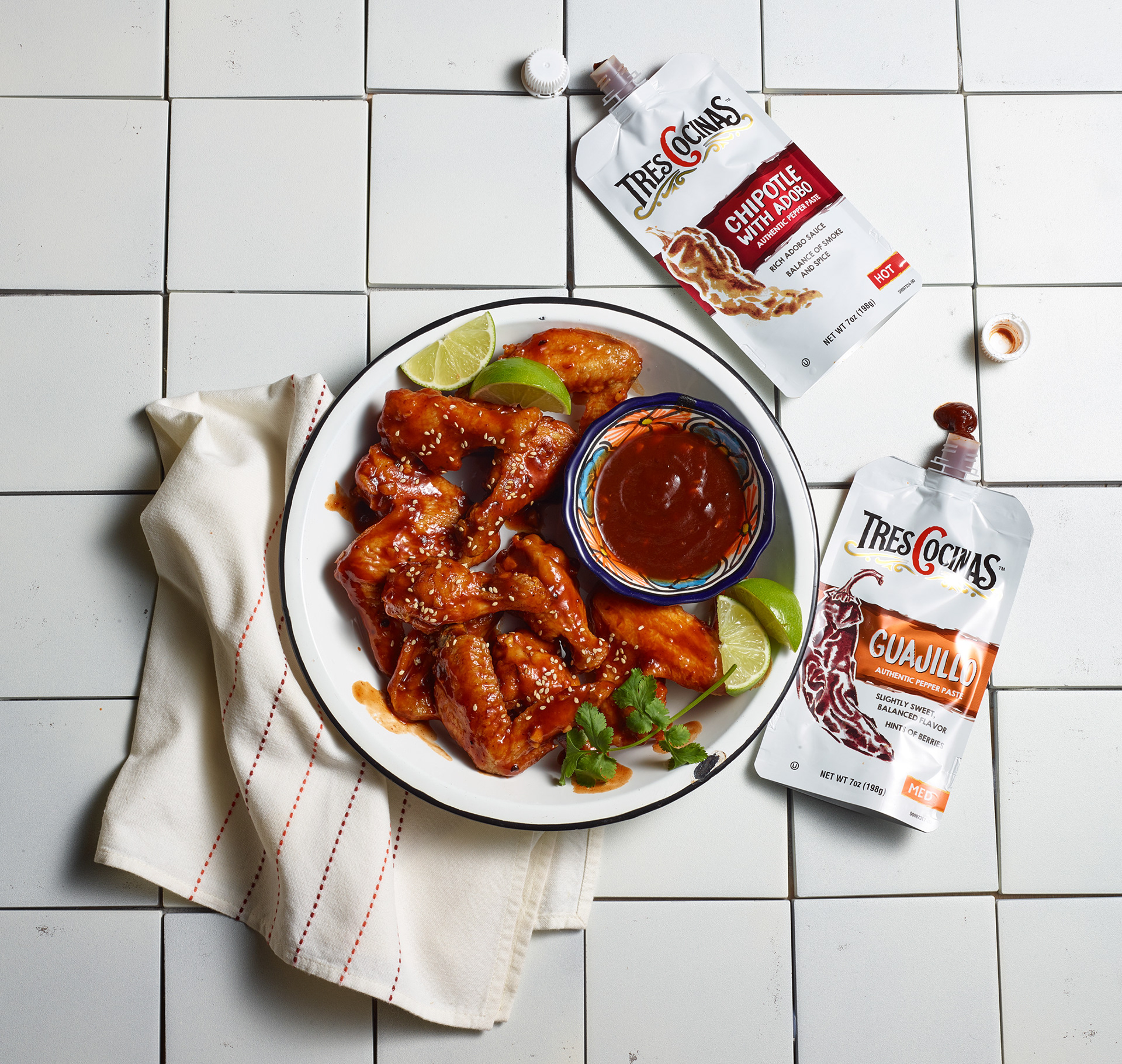
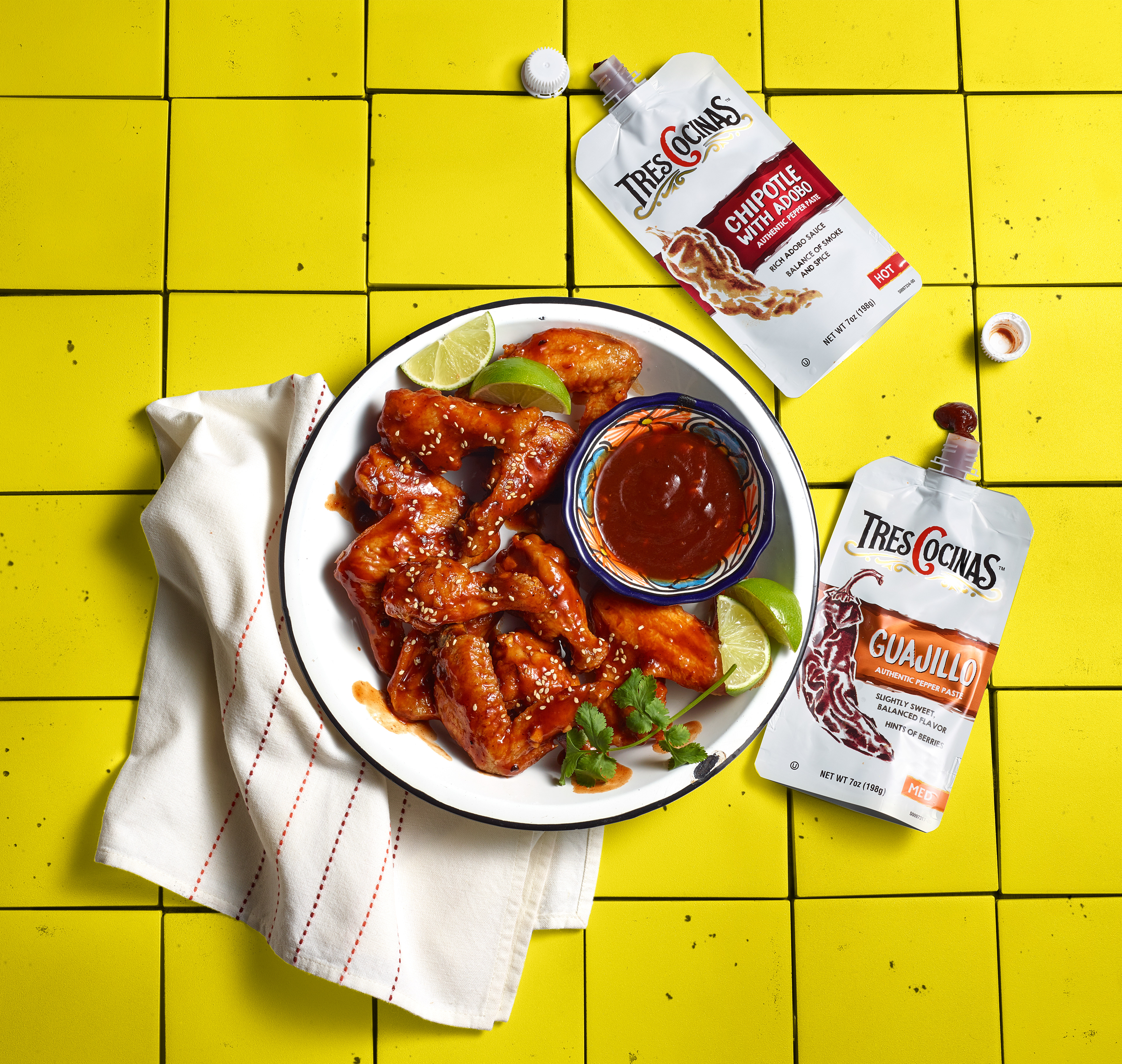
Art Direction: Drop background maintain shadows.
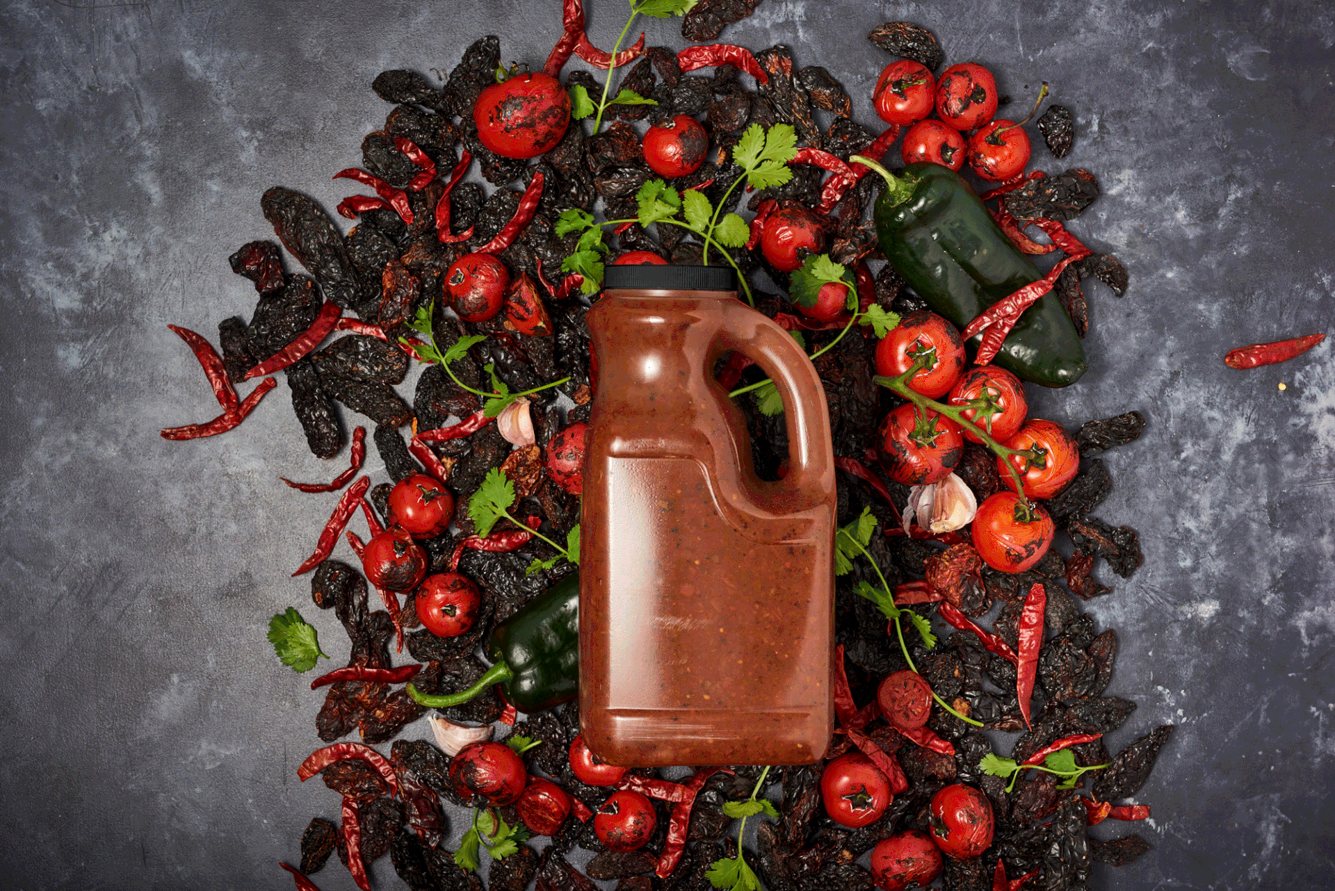
Art Direction: Darken background, add label, punch color slightly.
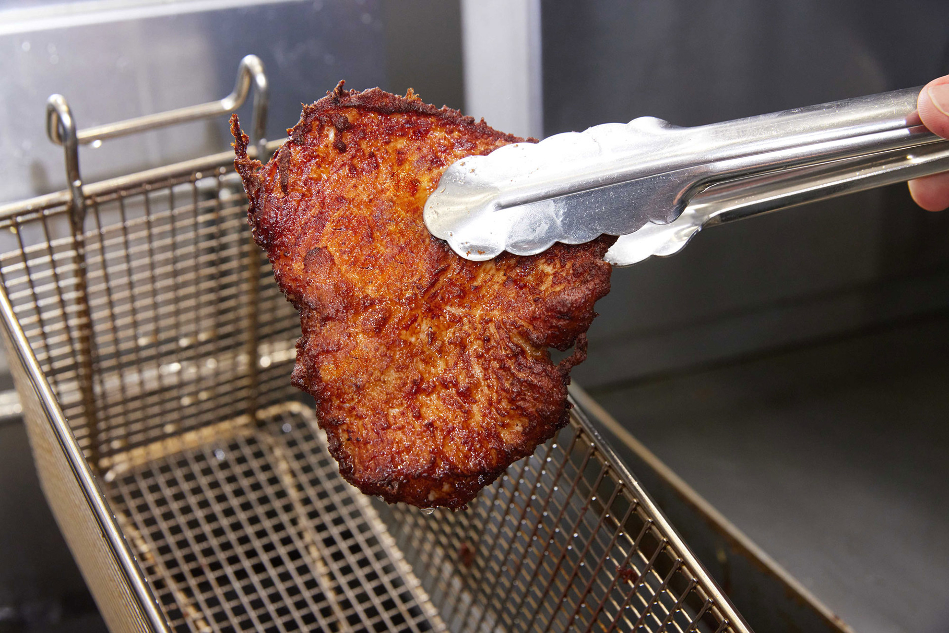
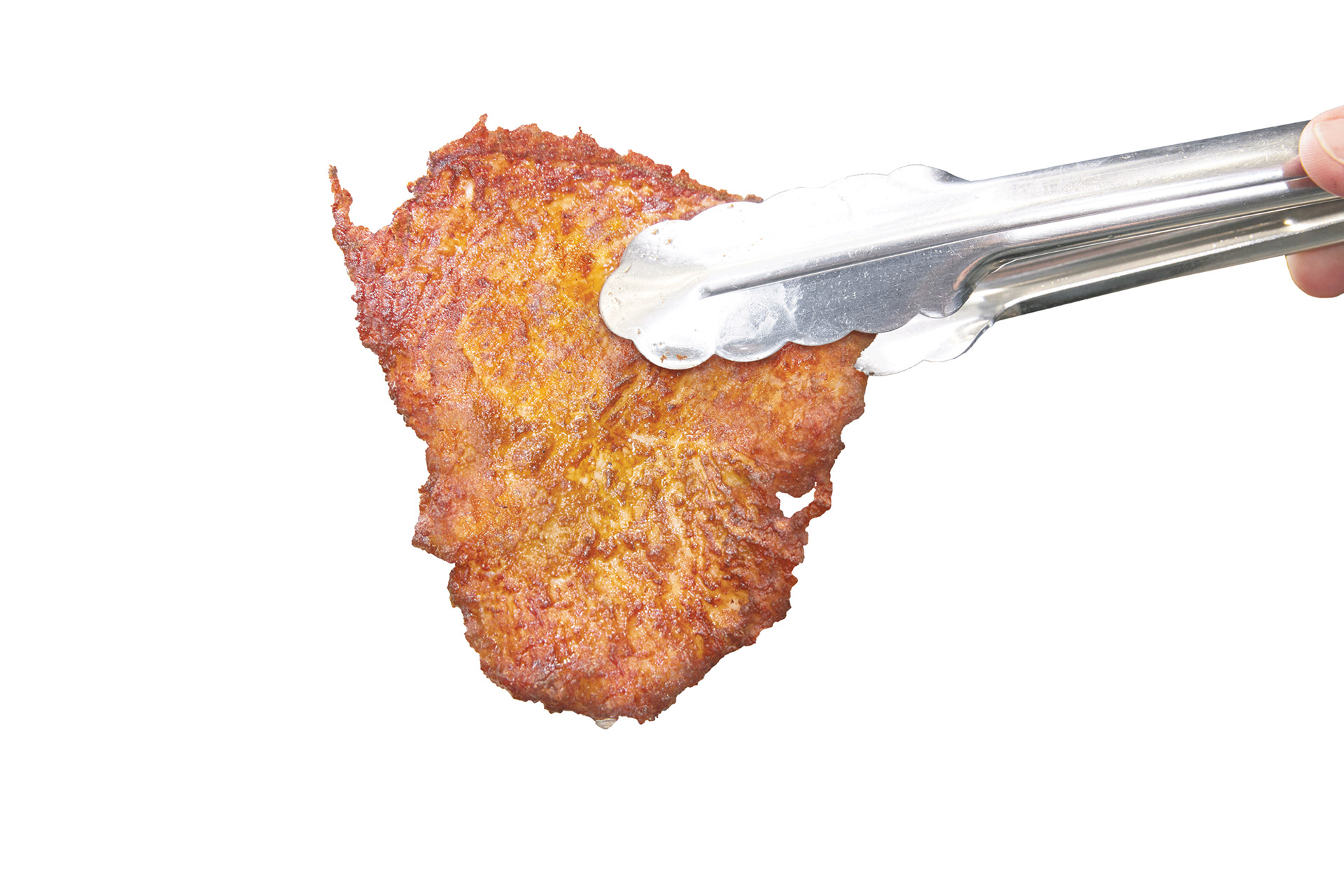
Client thought product looked burnt and requested it to look golden brown. Dropped background to place on white.